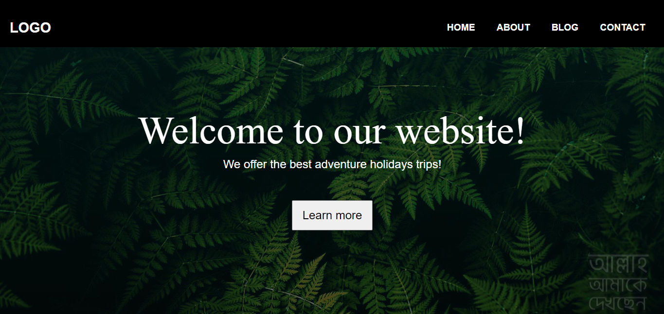
Hello guys today I am going to build a responsive navigation bar using HTML CSS and Javascript
so let’s get into it.
Here is Our markup for the navigation bar,
---
<!DOCTYPE html>

<html lang="en">
<head>
    <meta charset="UTF-8">
    <meta http-equiv="X-UA-Compatible" content="IE=edge">
    <meta name="viewport" content="width=device-width, initial-scale=1.0">
    <title>Document</title>
    <link rel="stylesheet" href="https://cdnjs.cloudflare.com/ajax/libs/font-awesome/6.2.1/css/all.min.css">
    <link rel="stylesheet" href="style.css">

</head>
<body>
    <header>
        <nav class="nav">
            <a href="/" class="logo">logo</a>
            <div class="hamburger">
                <i class="fa-sharp fa-solid fa-bars"></i>
            </div>
            <div class="nav-link hide">
                <a href="#">Home</a>
                <a href="#">about</a>
                <a href="#">blog</a>
                <a href="#">contact</a>
            </div>
        </nav>
    </header>
    <script src="./script.js"></script>
</body>
</html>
You can see at the top of the markup I just linked the Font Awesome CDN and then our style.css file
and I also added a script file at the end of the header tag, for the javascript.
Now give some design to our navigation using CSS
Here is the CSS reset
\*{
    box-sizing: border-box;
    margin: 0;
    padding: 0;
}

body{
    font-family: sans-serif;
    background:  whitesmoke;
    background: url(bg-hero.jpg) repeat no-repeat center center/cover;
}

a{
    text-decoration: none;
    color: #fff;
    font-size: 1.2rem;
    font-weight: bold;
    text-transform: uppercase;
}
After the CSS reset, we have to design the main navigation bar
Here is the Navigation bar design css.
/ *navigation style* /

.nav{
    display: flex;
    justify-content: space-between;
    align-items: center;
    padding-top: 20px;
    background: #000;
    width: auto;
    height: 100px;
}
.logo{
    font-size: 1.8rem;
    color: rgb(255, 255, 255);
    padding-left: 20px;
}

.hamburger{
    padding-right: 20px;
    cursor: pointer;
}
.fa-bars{
    color: #fff;
    font-size: 1.5rem;
}

.nav-link{
    position: fixed;
    width: 94%;
    top: 5rem;
    left: 18px;
    background-color: rgb(38, 42, 43);
}

.nav-link a{
    display: block;
    text-align: center;
    padding: 10px 0;
}

.nav-link a:hover{
    background-color: rgb(122, 122, 94);
    / *border-radius: 10%;* /
}
.hide{
    display: none;
}
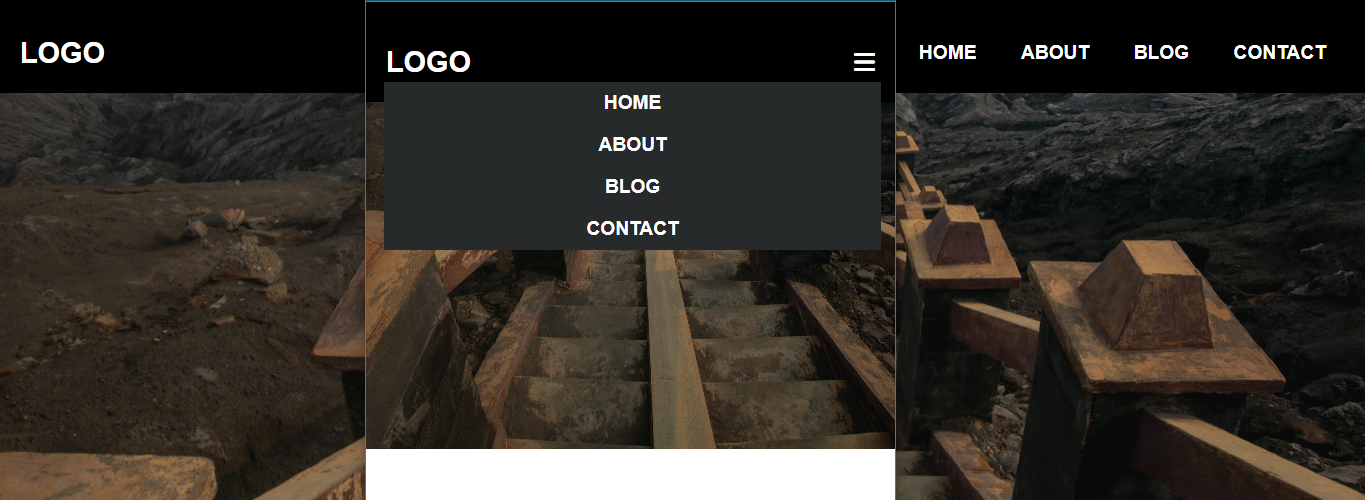
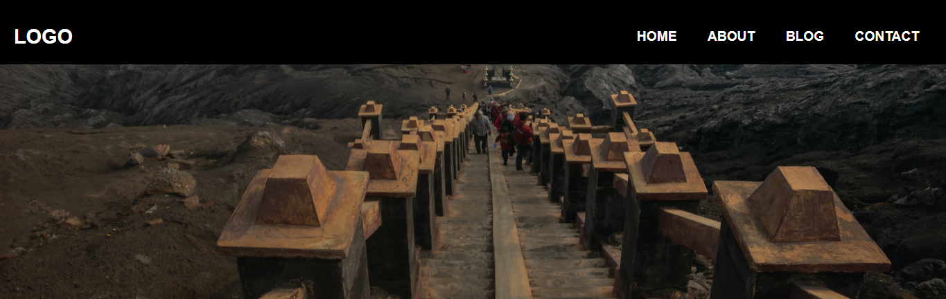
Now the Mobile design is done
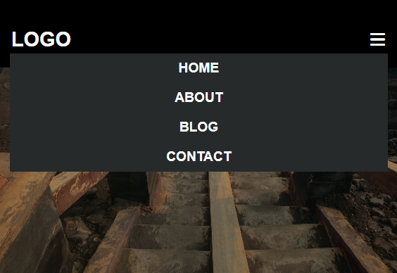
after the mobile design, we have to make the design perfect for the Desktop. and for this, we’ll use the @Media query
here is the code
@media screen and (min-width: 600px){
    .nav-link{
        display: block;
        position: static;
        width: auto;
        margin-right: 20px;
        background: none;
    }
    .nav-link a{
        display: inline-block;
        padding: 15px 20px;
    }
    .hamburger{
        display: none;
    }
}
At the last, we have to write two lines of javascript code for the hamburger icon
Javascript
const hamburger = document.querySelector('.hamburger');
const navLink = document.querySelector('.nav-link');

hamburger.addEventListener('click', () => {
  navLink.classList.toggle('hide');
});
if you like this short tutorial then follow me at https://twitter.com/xdevimran