Hello everyone welcome back to my blog, today I will design a hero section with HTML and CSS so let's get started. Here is the HTML code for the section <!-- hero section --> <section
Hello everyone welcome back to my blog, today I will design a hero section with HTML and CSS so let's get started.
Here is the HTML code for the section
<!-- hero section -->
<section class="hero">
<div class="hero-content">
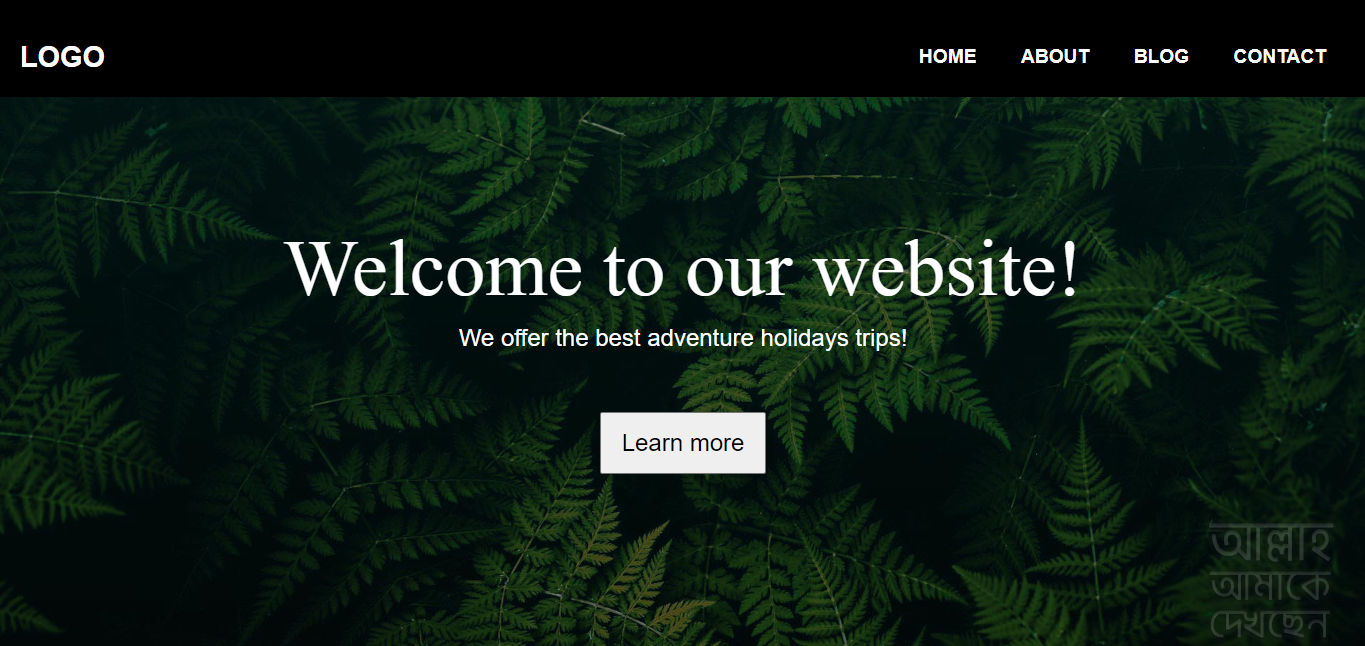
<h1 class="hero-title">Welcome to our website!
</h1>
<h2 class="hero-subtitle"> We offer the best adventure holiday trips! </h2>
<button type="button" class="hero-button">Learn more</button>
</div>
</section>
in the hero section, I just take two headings and one call to action button and that's the markup
after writing the HTML we need to design it.
here is the CSS for the design
/* hero section  */
.hero{
    display: flex;
    justify-content: center;
    align-items: center;
    height: 75vh;
    padding: 0 80px;
    text-align: center;
    color: #fff;

}
.hero-title{
    font-family: serif;
    font-size: 5rem;
    font-weight: normal;
    margin: 10px;
}
.hero-subtitle{
    font-size: -1.5rem;
    font-weight: normal;
    margin: 10px;
}
.hero-button{
    font-size: 1.5rem;
    padding: 15px 20px;
    margin-top: 50px;
    cursor: pointer;
}
Here is the final output
https://i.ibb.co/6YZQ9x8/Screenshot-1.png
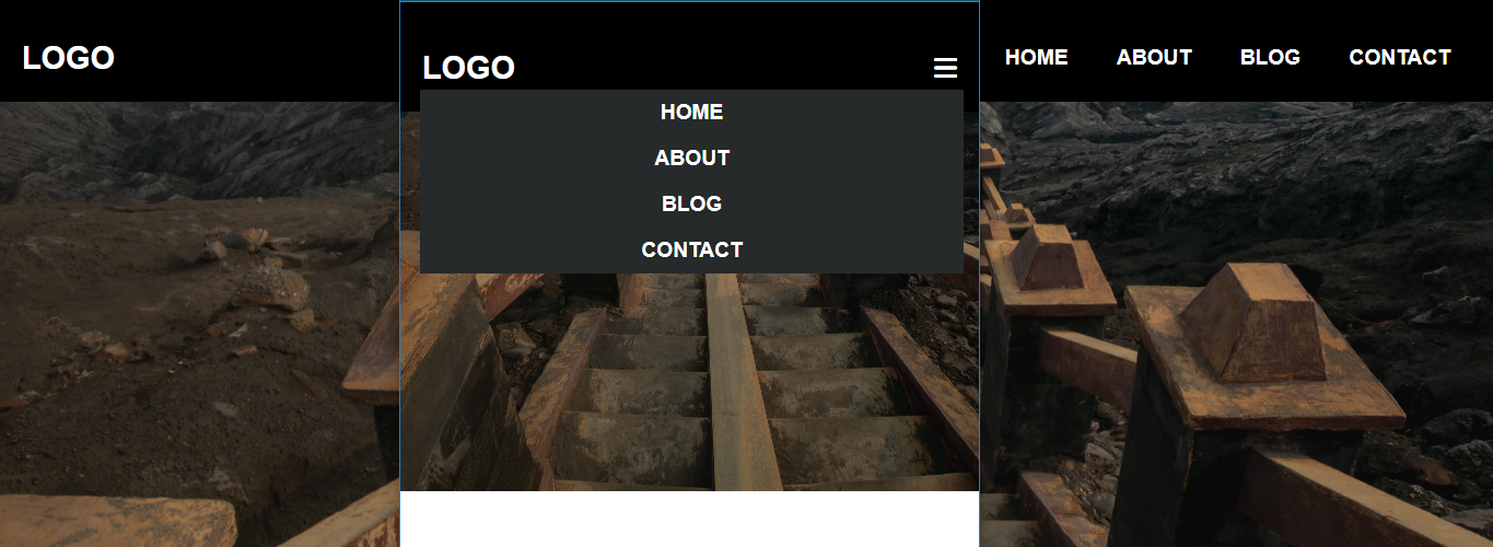
if you don’t know how to make a responsive navigation bar using HTML, CSS, and js you can readout my first article